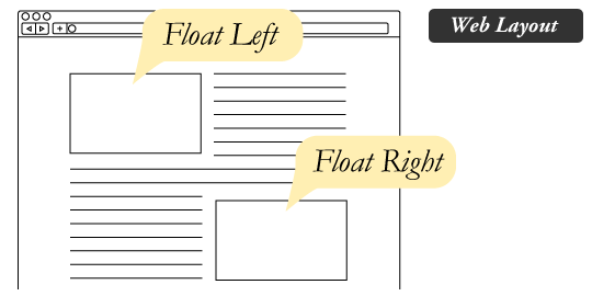
class: middle <span>.eight[CSET-110]</span><br> <span>.eight[Web Development I]</span> # CSS Layouts --- # Contents: - [Floats](#floats) - [Flexbox](#flexbox) - [Grid](#grid) --- name: floats # Floats - Content that appears to be "floating" - Usually an image with text wrapping around it  --- # Layouts with Float? [MDN: Floats](https://developer.mozilla.org/en-US/docs/Learn/CSS/CSS_layout/Floats) - In mid-2000s, designs got fancier and devices got smaller - We hacked it to float everything, creating multi-column layouts - Using a tool for unintended purposes can lead to problems --- # Clearfix - Floated elements are pulled out of normal flow - Browser can't calculate their height for the rest of the content - [Clearfix hack example](https://learnlayout.com/clearfix.html) - [CSS-Tricks: other clearfix hacks](https://css-tricks.com/snippets/css/clear-fix/) --- # Legacy Layout - A .eight[legacy] technique is outdated, but still commonly used - The W3C saw issues with these layout techniques - CSS3 gave us some new layout options: flexbox and grid - Now floats are back to their original purpose -- Note - Floats aren't legacy, just using them for page layouts. --- # Remember, CSS is a Spec - CSS3 is newest version, broken into modules - Modules have a status: .eight[Drafts] and .eight[Recommendations] - Meaning old specs have changed, replaced, or aren't used anymore - Also, new specs might not work everywhere: Check [caniuse.com](https://caniuse.com) --- class: middle, center And even if it's supported in a browser, it might not look the same... # [The div that looks different in every browser](https://twitter.com/Martijn_Cuppens/status/1015169981368225793) --- # Why learn legacy CSS? 1. You will definitely still see it. 2. You might have to support a legacy browser. 3. You might have to update a legacy project. --- # Floating Sidebar - Left + Left? - Left + Right? - Right + Left? - Right + Right? # [Codepen Example](https://codepen.io/zachfedor/pen/MWgLxoG?editors=1100) --- # Floating Columns - Horizontally stacking blocks within a container - Can be any element, usually block level elements - Don't forget `box-sizing: border-box;` to make math easier # [Codepen Example](https://codepen.io/zachfedor/pen/aboXMpP?editors=1100#0) --- # More Resources: - [CSS-Tricks: All About Floats](https://css-tricks.com/all-about-floats/) - [A List Apart: CSS Floats 101](https://alistapart.com/article/css-floats-101/) --- # Limitations with Float and Position - How can you center an element vertically? - How can you make sibling elements take up equal width/height regardless of available width/height? - How can you make multiple columns have similar height regardless of their content? --- name: flexbox # Flexible Box Layout [MDN: Basic Concepts of Flexbox](https://developer.mozilla.org/en-US/docs/Web/CSS/CSS_Flexible_Box_Layout/Basic_Concepts_of_Flexbox) - One dimensional layout: a single row or a single column - Can flexibly distribute available space - Can flexibly align elements --- class: center, middle `display: flex;` Declaration for the parent element, the "flex container" --- # Two Axes Defined by `flex-direction` property - Values are `row` or `column` - Can be reversed, `row-reverse` or `column-reverse` - .eight[Main axis] and .eight[Cross axis] depend on this value - Other flex properties are related to these axes --- class: middle, center  --- class: middle, center  --- class: middle, center  --- class: middle, center  --- # Flexbox Is Language Agnostic Not Left & Right. Use Start & End.   --- # Default Flex Container - Items display in row from starting edge - Items don't stretch to fill main axis - Items stretch to fill cross axis - `flex-basis: auto;`* - `flex-wrap: nowrap;`* \* We'll get to these later. --- # Flexible Space Properties on flex container affect items within: - `justify-content` property aligns items on Main axis - `align-items` property aligns items on Cross axis - Initial values are `flex-start` and `stretch` --- # Align Items - `stretch` - `flex-start` - `flex-end` - `center` --- # Justify Content - `flex-start` - `flex-end` - `space-around` - `space-between` - `space-evenly` --- # Flexbox Sidebar - Which element is the container? - `display: flex;` # [Codepen Example](https://codepen.io/zachfedor/pen/zYOeVxa?editors=1100#0) Compare to [Floating Sidebar](https://codepen.io/zachfedor/pen/MWgLxoG?editors=1100) example --- # Floating Columns - Horizontally stacking blocks within a container - Can be any element, usually block level elements - Don't forget `box-sizing: border-box;` to make math easier # [Codepen Example](https://codepen.io/zachfedor/pen/eYOxwGj?editors=1100#0) Compare to [Floating Columns](https://codepen.io/zachfedor/pen/aboXMpP?editors=1100#0) example --- # More Resources: - [MDN: Learn Flexbox](https://developer.mozilla.org/en-US/docs/Learn/CSS/CSS_layout/Flexbox) - [CSS-Tricks: A Complete Guide To Flexbox](https://css-tricks.com/snippets/css/a-guide-to-flexbox/) - [Codrops: Flexbox Reference](https://tympanus.net/codrops/css_reference/flexbox/) --- class: middle, center # .fourteen[Try Them Out] # [Flexbox Froggy](https://flexboxfroggy.com/) # [Grid Garden](https://cssgridgarden.com/)